In a digital landscape where first impressions are often made in seconds, the colours a brand chooses to wear can speak louder than words. For parenting and family brands, where emotional resonance, trust and authenticity are essential, colour becomes more than just a visual detail, it’s a psychological touchpoint that can shape how a brand is perceived, remembered and trusted.
From the warmth of earthy tones to the confidence of cool blues, colour plays a central role in guiding how families connect with the brands they welcome into their lives. Understanding the emotional and behavioural impact of colour allows brands to craft more than just aesthetics, they create experiences that speak directly to their audience’s values, needs and desires.
As digital competition grows and visual content dominates marketing, brands must work harder to capture attention and build lasting emotional connections. Colour has emerged as one of the most influential tools in this effort, shaping consumer perception before a single word is spoken. A brand’s identity needs to work smoothly across different platforms and devices while still feeling consistent and trustworthy. Colour plays a vital role in creating that connection. This is especially important for family‑focused brands, where a warm look and clear emotional cues help build trust and engagement.
It takes just 90 seconds for someone to form a subconscious opinion of a brand, and up to 85% of that impression is based on colour alone. Colour can improve brand recognition by as much as 80%, offering a powerful shortcut to familiarity, trust and preference.
For parenting audiences in particular, where purchases are often rooted in emotional or lifestyle decisions rather than impulse, colour has the power to quietly reassure, inspire confidence and reinforce values.
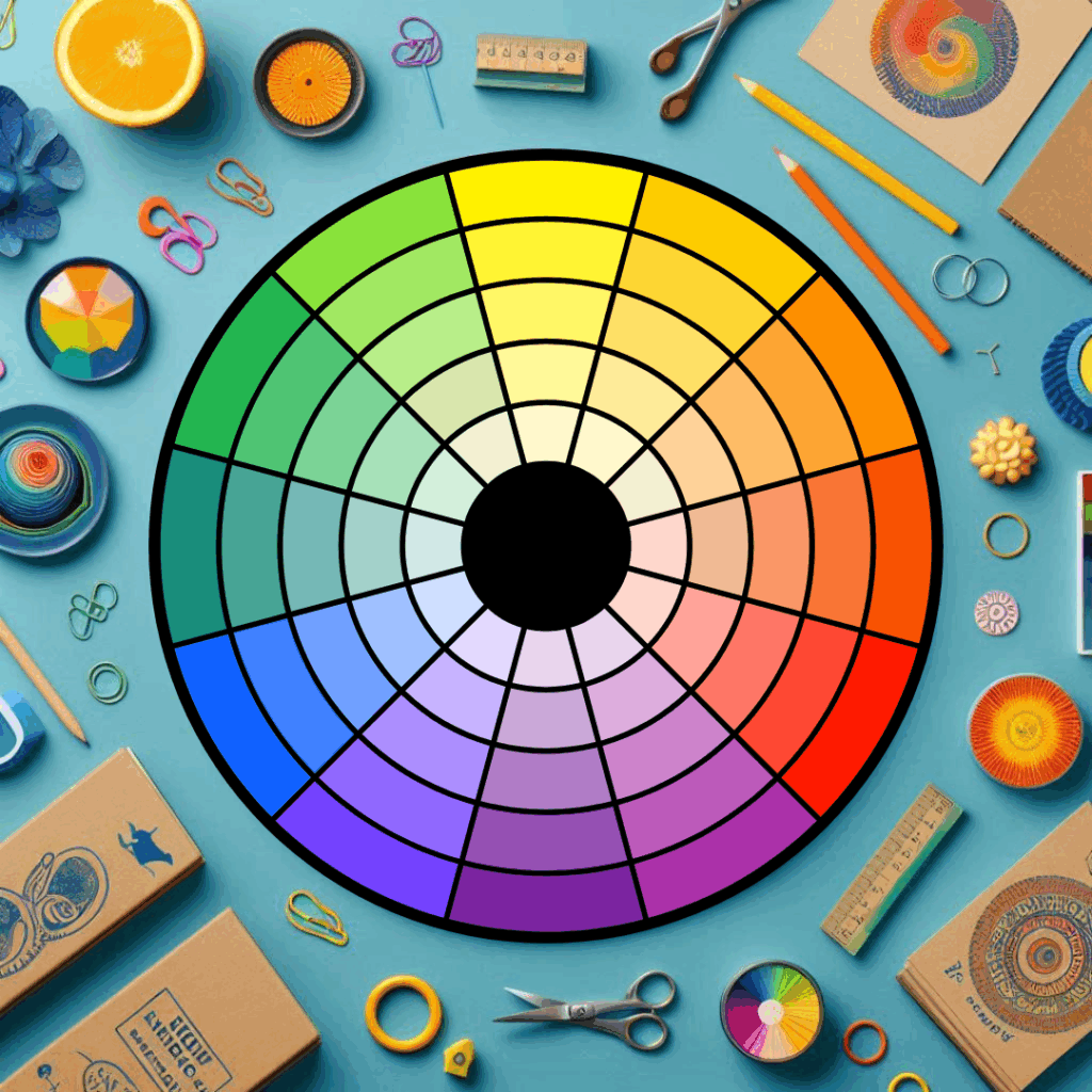
Red evokes passion, intensity and drive. For parenting brands, it can signal action, ideal for calls-to-action or spotlighting products that promote active lifestyles or immediate needs.
Often associated with safety, reliability and peace of mind, blue remains a dominant choice in sectors where trust is vital. For baby monitors, health products or anything promising reassurance, blue offers psychological comfort.
A favourite among eco-conscious families, green connects with ideas of growth, calm and wellness. It’s especially powerful for organic or sustainable brands aiming to align with modern parenting values.
Bright and playful, yellow taps into feelings of happiness and youthfulness. Though its intensity can be divisive, when used in moderation it evokes energy and friendliness, especially suitable for early childhood brands.
Natural, muted shades speak to groundedness and sincerity. These tones are increasingly favoured by brands embracing transparency, sustainability and a back-to-basics approach to family life.
Colour preferences don’t exist in a vacuum. For instance, while blue is a universal favourite in the UK, other tones may carry differing associations across regions or generations. Gen Z, in particular, tends to gravitate toward unique, personalised palettes and bold combinations, adding complexity to colour decisions.
Half of consumers have chosen one brand over another purely based on colour. Among millennial and Gen Z parents, this is even more pronounced, as visual identity plays a key role in brand trust.
Whether across packaging, social media, or email marketing, a consistent colour scheme reinforces your brand’s voice and values. In parenting PR, where familiarity and dependability influence purchasing decisions, colour cohesion can offer the reassurance consumers subconsciously seek.
From sage green to terracotta, muted natural hues reflect a growing consumer demand for authenticity, wellness, and environmental responsibility. These palettes resonate particularly well with modern families prioritising health, nature and simplicity.
Some brands are now experimenting with dynamic colour schemes that respond to user preferences or emotional tone, creating more personalised, emotionally intelligent experiences.
Photography and branded visuals play a key role in reinforcing a colour strategy. For example, a brand promoting eco-friendly nappies might use natural light, recycled props and earthy tones to echo its values. In contrast, a high-tech parenting gadget might favour sharp contrast, metallic shades and digital blues.
Start by identifying the emotional landscape you want your brand to occupy, comfort, playfulness, safety, innovation, and build your palette from there.
Cultural associations, personal preferences and generational traits all impact how colour is received. Use market research to uncover what your target parents respond to most strongly.
From logos and websites to packaging and social content, visual consistency builds confidence. When parents see familiar tones across every interaction, it reinforces reliability and trust.
Your colour palette should reflect your brand story visually. A business rooted in holistic parenting should feel grounded and calming. A brand focused on tech-forward family solutions might use cool, minimalistic tones.
An expert eye can make all the difference in translating brand emotion into colour. Designers with experience in parenting and lifestyle branding can help strike the right balance between trend, impact and relevance.
Colour is no longer just a design decision, it’s a strategic tool that shapes how families experience, remember and trust a brand. For parenting and family-focused businesses, the right colour palette does more than attract attention; it reassures, inspires and builds long-lasting emotional connection. Whether you’re designing a product, refreshing a website, or planning a PR campaign, thoughtful colour choices ensure your brand speaks the right emotional language from the very first glance.