Colour is one of the most powerful tools in brand design, especially within the baby and family sector where emotional connection and trust are paramount. In 2025, understanding the psychology of colour goes beyond aesthetics; it’s about creating meaningful experiences that resonate with parents and children alike. The right palette can evoke feelings of safety, warmth, and joy, guiding purchasing decisions and fostering brand loyalty. This article explores how baby and family brands can harness colour psychology to craft identities that speak directly to their audiences’ hearts and minds.
Parents seek reassurance when choosing products or services for their children. Colours like soft blues and gentle greens evoke calmness, reliability, and health, qualities that instil confidence. Blue, in particular, remains the most trusted colour, associated with security and dependability, making it a staple for baby brands focused on safety and wellbeing.
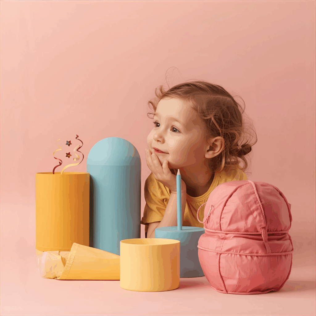
Bright, warm hues such as coral, golden yellow, and energetic magenta tap into feelings of optimism, happiness, and playfulness. These colours appeal to both children’s natural curiosity and parents’ desire to nurture joyful development. Incorporating these tones thoughtfully can make brands feel lively and approachable without overwhelming the senses.
Earthy, organic tones like muted browns, sage greens, and terracotta have gained prominence as families increasingly prioritise natural and sustainable choices. These colours suggest groundedness and environmental responsibility, aligning brand values with the growing eco-conscious mindset of modern parents.
Colour preferences and perceptions evolve with age. For infants and toddlers, simple, high-contrast colours like bold reds and blues help stimulate visual development. As children grow, more nuanced palettes with softer pastels or jewel tones can engage their expanding emotional and aesthetic sensibilities. Brands that adapt their colour strategies to these developmental stages create more relevant and engaging experiences.
The 2025 trend towards inclusivity encourages brands to move beyond traditional gendered colours. Soft vintage pinks like Transcendent Pink and versatile neutrals such as rose taupe or green clay appeal broadly, reflecting diverse family dynamics and promoting acceptance.
Maintaining a consistent colour scheme across packaging, digital platforms, and advertising reinforces brand identity and fosters familiarity. Parents, often juggling multiple responsibilities, rely on visual cues to quickly identify trusted brands. Sudden colour shifts can disrupt this recognition and even weaken emotional bonds.
Emerging AI technologies enable brands to implement dynamic colour schemes that adjust based on user preferences or moods, offering personalised experiences that deepen emotional engagement.
Combining vibrant colours with sophisticated neutrals like navy charcoal or golden sand creates visual interest while maintaining a sense of calm and reliability, an ideal balance for family brands.
Baby product manufacturers, family lifestyle brands, parenting content creators, and healthcare providers can all leverage colour psychology to solve the challenge of standing out in a crowded market. Thoughtful colour use helps these brands build trust, evoke positive emotions, and foster lasting connections with parents and children.
The psychology of colour is a vital element in designing compelling baby and family brands. By understanding how different hues influence emotions and behaviours, brands can create visual identities that not only attract attention but also nurture trust, joy, and authenticity. In a sector where emotional resonance is key, colour becomes a strategic asset, guiding parents’ choices and shaping lifelong relationships between families and the brands they cherish.