In a digital world shaped by speed, choice, and shrinking attention spans, the first impression your brand makes is often the only one that counts. From websites and social media to email campaigns and digital ads, every visual touchpoint sends an instant message about who you are, what you stand for, and whether you’re worth someone’s time. For baby, parenting, and family brands, where trust is paramount and emotional connection is everything, design isn’t just a surface layer, it’s the foundation. The right look and feel doesn’t just catch the eye; it builds credibility, shapes perception, and drives results.
Online, your audience forms an opinion in the blink of an eye, often within 50 milliseconds. This judgement is almost entirely visual. Long before your brand values or USPs are read, users have already decided whether to stick around or click away. That split-second decision shapes everything that follows.
Psychologically, the first thing we see or feel sticks. Known as the primacy effect, this explains why early impressions dominate our lasting perception of a brand. A sleek, inviting interface is remembered as intuitive and trustworthy. A clunky or outdated design? That’s much harder to overcome, no matter how strong the product or service.
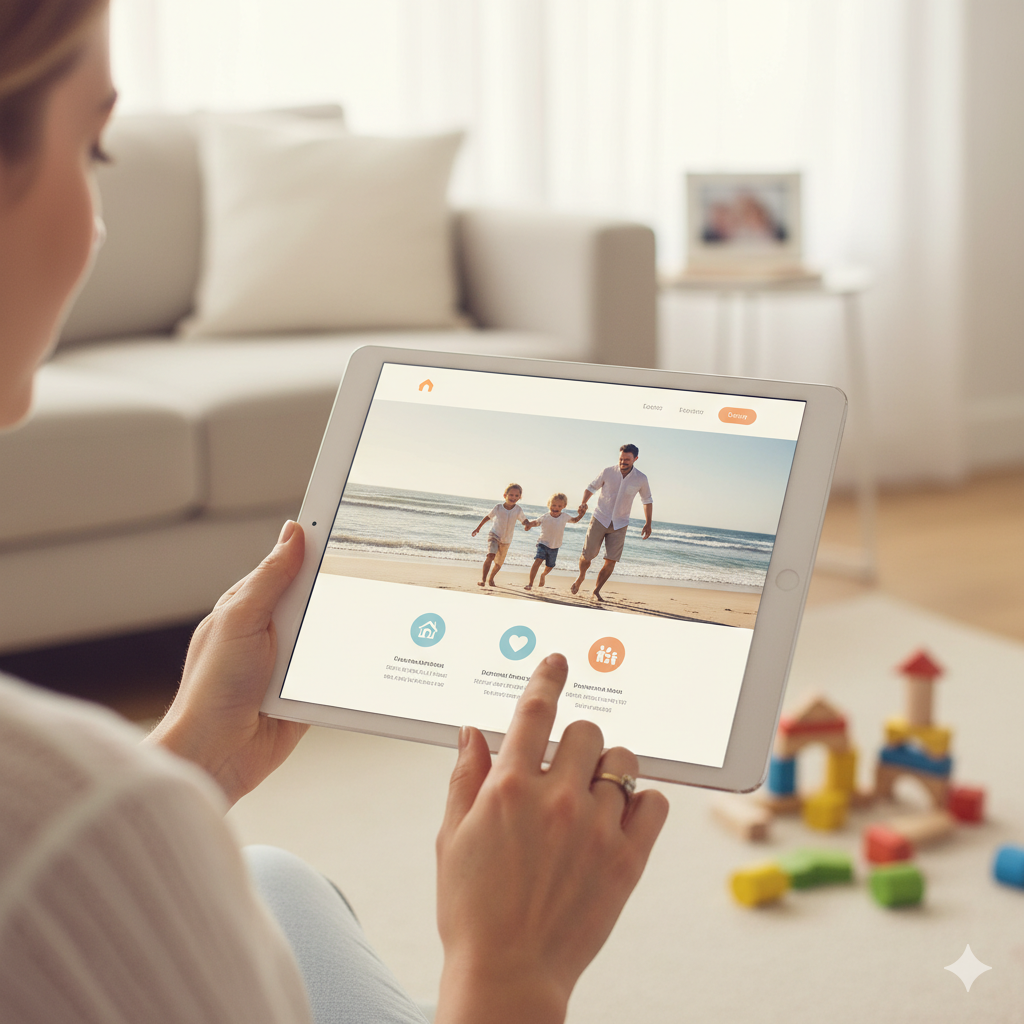
Parents and caregivers, often pressed for time, rely heavily on visual cues to assess whether a brand feels safe, reputable and aligned with their values. Professional design signals care, attention to detail and credibility. If something feels off visually, it can raise red flags that no amount of persuasive copy can fix.
While usability is important, studies repeatedly show that initial reactions are guided by visual appeal. In fact, people tend to rate visually attractive websites as more usable, even when the functionality remains unchanged. A beautiful interface creates goodwill, making users more forgiving of minor imperfections.
In today’s digital marketplace, product features and tech capabilities often overlap. What differentiates one brand from another is no longer just the product, it’s the experience. That experience is defined by design. From colour and typography to layout and photography, every visual decision becomes a competitive advantage.
Colour choices evoke emotion before a single word is read. A soft pastel palette may suggest calm, care, and gentleness, ideal for parenting brands, while bolder tones may convey innovation or energy. Similarly, high-quality imagery gives your brand depth, relatability, and personality, showing rather than telling your story.
Clean, well-structured pages create a sense of ease. Visitors feel confident when they can find what they’re looking for quickly. Cluttered layouts, on the other hand, increase friction and cause uncertainty, especially problematic for users already juggling the demands of family life.
Consistent, thoughtful typography anchors your brand visually. Font pairings, sizing, and spacing may seem subtle, but they play a key role in shaping how content is received and remembered. Unified branding across all channels reinforces professionalism and builds trust over time.
A positive first impression significantly boosts the chances of users staying on your site, exploring your offering, and coming back. In contrast, a jarring or forgettable design can lead to high bounce rates and lost opportunities. For parenting brands, consistency in design also creates familiarity, vital when building long-term loyalty.
Design influences behaviour. Whether you’re driving sign-ups, encouraging purchases, or promoting downloads, well-designed experiences increase the likelihood of action. Engaging visuals guide users through the journey, subtly nudging them toward conversion without ever feeling pushy.
In an increasingly visual economy, strong design is often the tie-breaker. When competing against brands with similar offerings, the one that feels more polished, intentional, and appealing is usually the one that wins attention, and earns the sale.
Authentic, high-quality photography speaks volumes. It gives your brand a face, humanises your messaging, and fosters emotional connection. For family-focused brands, this is especially important, parents want to see real people, relatable moments, and environments they can trust.
Whether it’s a homepage, an Instagram grid or an email header, cohesive visual branding creates a sense of reliability. Colour palettes, visual themes, and tone must align seamlessly to build a strong, recognisable presence.
Great design goes hand-in-hand with user experience. Easy-to-navigate pages keep visitors engaged longer, reducing bounce rates and increasing the likelihood of conversions. Search engines take note of these behaviours, meaning strong visual design can indirectly improve SEO performance as well.
In digital spaces, design remains your most powerful first impression. It doesn’t just capture attention, it earns trust, guides behaviour, and sets the tone for long-term relationships. For baby, parenting and family brands, where emotional connection is everything, thoughtful, high-quality design is more than aesthetic, it’s strategic. Design has become the language through which brands communicate their values, reassure their audience and stand out in crowded markets. As the digital landscape evolves, one thing remains clear: design still rules.